How EdgeUI 3.0 Eliminated Design Debt and Scaled InvestEdge
InvestEdge empowers wealth advisors to create proposals, reviews, and executive-ready reports for high-net-worth clients within minutes.
EdgeUI 3.0 recognises that a robust design system is essential to sustain velocity, ensure brand consistency, reduce rework, and future‑proof the product as features, clients, and integrations scale.
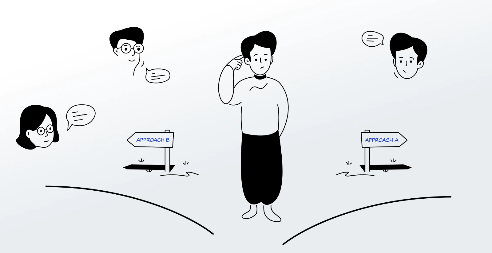
Task
Pitched the urgent need for a design system to leadership, then single-handedly researched, designed, and implemented EdgeUI 3.0. This streamlined collaboration, standardized UI components, reduced design debt, and achieved 85% of initial goals for InvestEdge’s scalability and consistency.
Strategy
User-centred Design, Use-case & Competitive Analysis, Accessibility Standards, Continuous Feedback
Design
Atomic Design, Design Tokens, Style Guide Creation, Documentation, Scalable Systems, White-labelling,
Tools
Figma, Storybook, Microsoft Teams, Heroicons.
Duration
4+ months (ongoing)
Elevating InvestEdge With A Scalable Design System
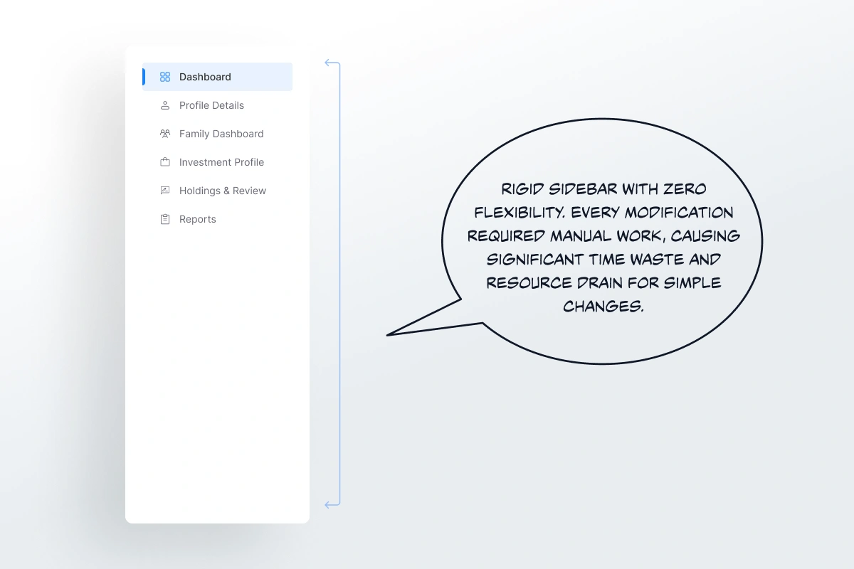
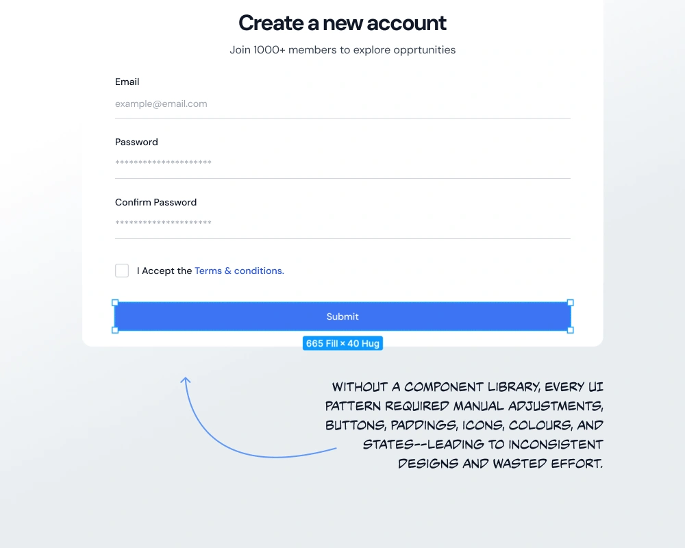
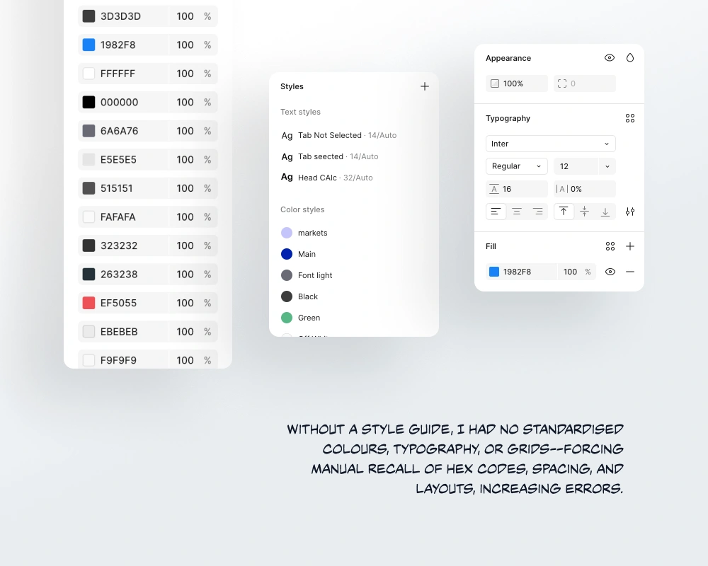
The legacy system lacked core components, style tokens, and documentation. The result: inefficiency, inconsistency, and costly fixes across InvestEdge’s enterprise implementations.
Missing components and undefined styles causing inconsistent UI across features.
Fragmented handoffs leading to repeated developer–designer miscommunications.
Rapid iterations creating growing design debt and wasted rework time.
EdgeUI 3.0—A Comprehensive, Practical Design Upgrade
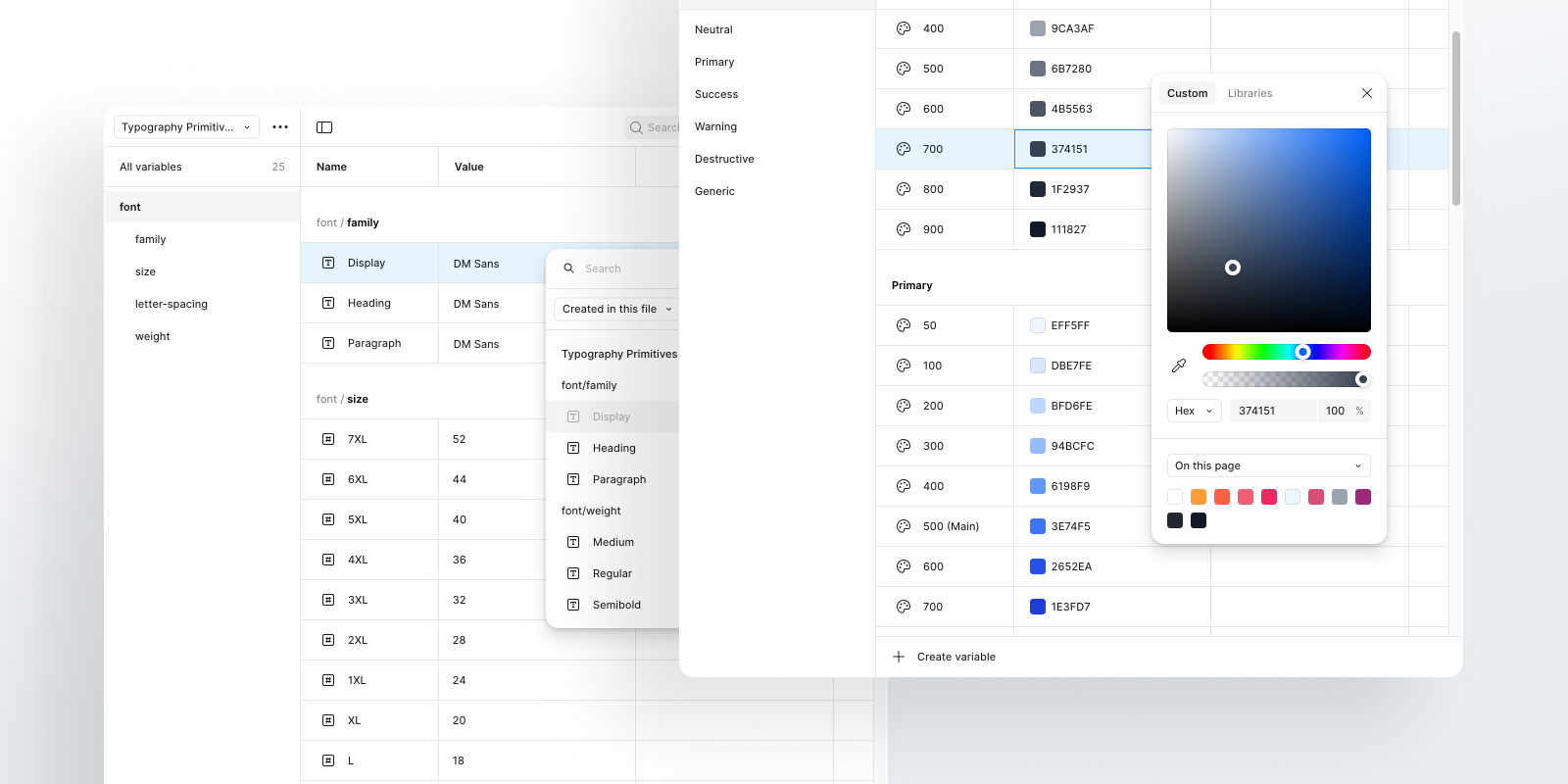
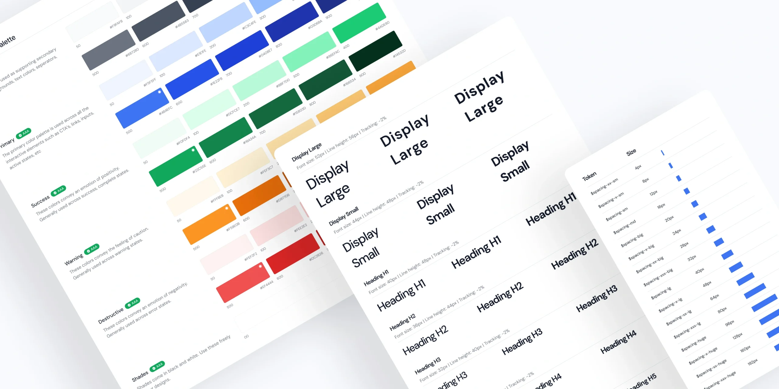
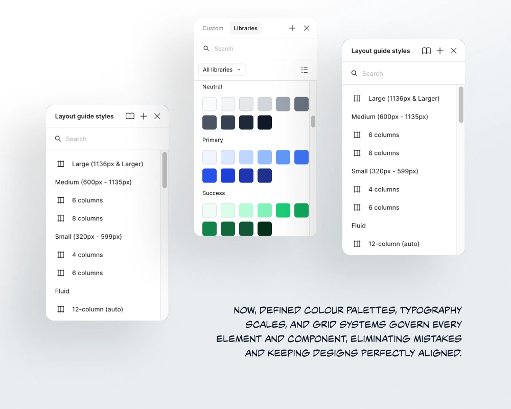
EdgeUI 3.0 introduced reusable components, a complete style guide, a clear content guide, and implementation documentation with do’s/don’ts. It standardised typography, colour, spacing, and behaviours. Design variables and tokens are planned for rapid theming, portability, and contributor onboarding, accelerating delivery while preserving brand integrity.
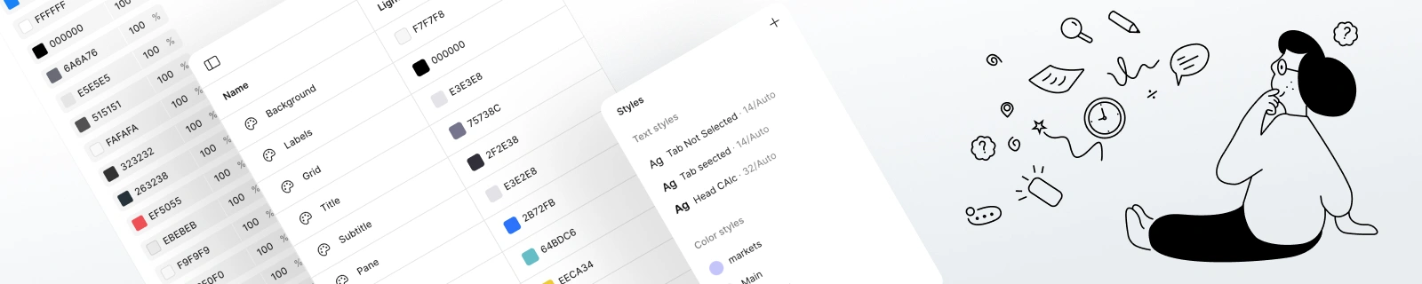
Established a unified style guide enforcing consistent typography, colour, and spacing.
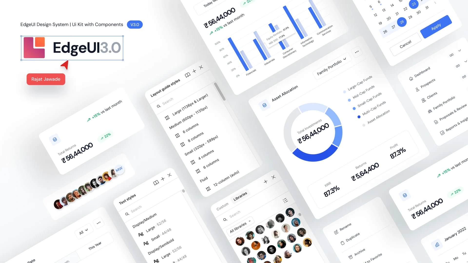
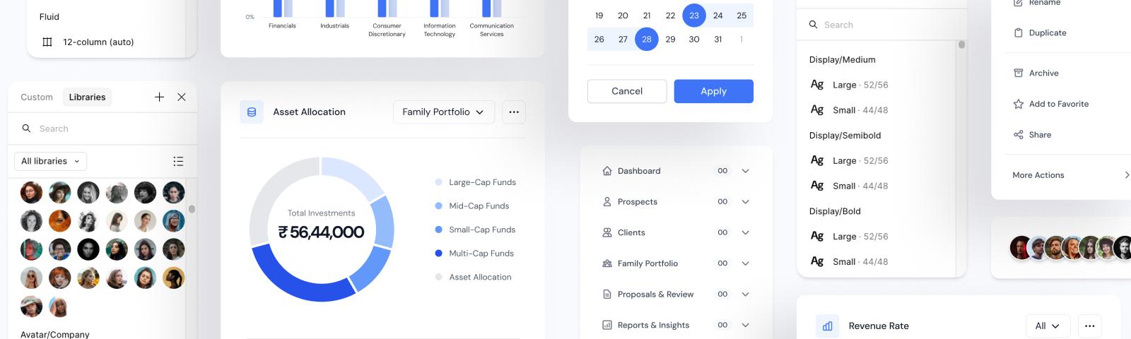
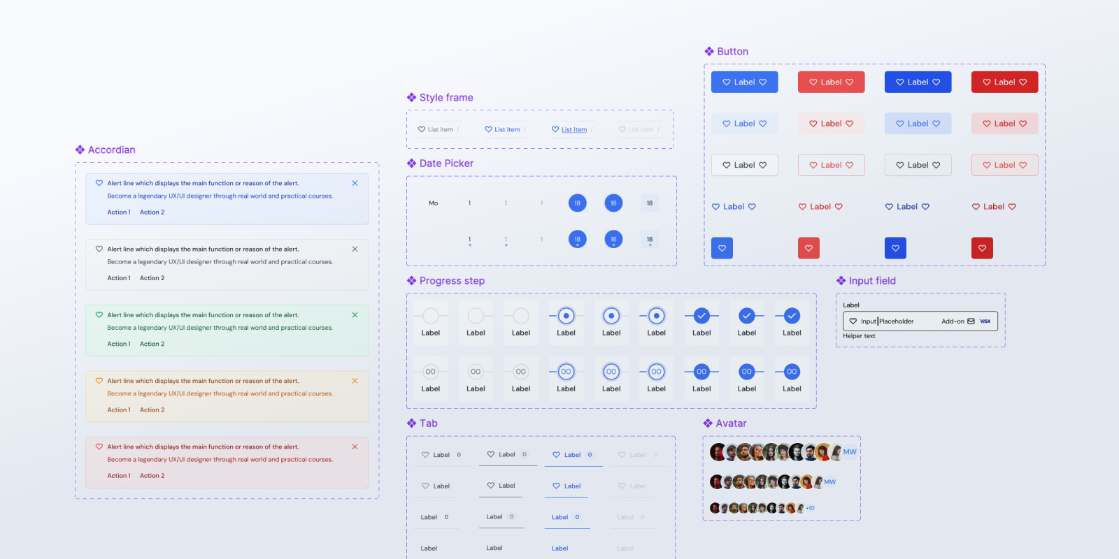
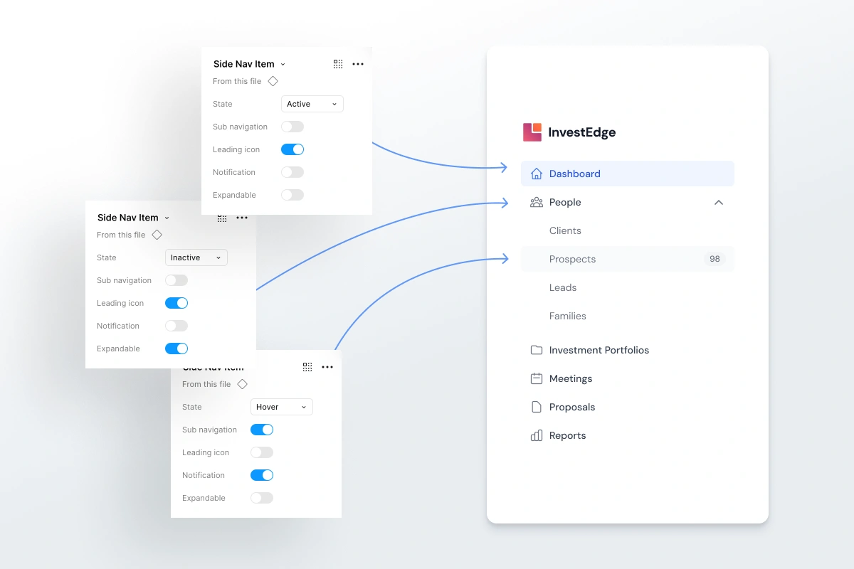
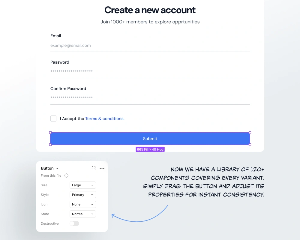
Built a 120+ component library with clear usage rules and accessibility guidelines.
Created comprehensive documentation with do’s/don’ts and planned design tokens for easy theming.
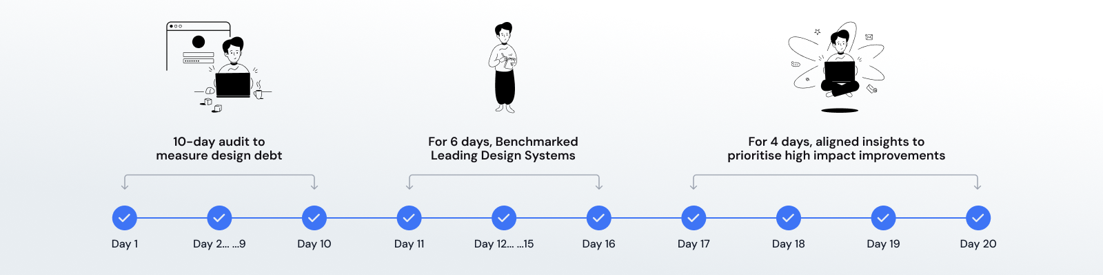
A Ten‑Day Deep Dive To Reset The Foundation
I began with a focused audit to quantify design debt, map inconsistencies, and uncover patterns driving rework. I benchmarked leading systems and aligned findings with InvestEdge’s domain needs. This groundwork clarified priorities, de‑risked decisions, and set the tone for a pragmatic, adoption‑first system.
Conducted a 10-day audit to measure design debt and identify inconsistency hotspots.
Benchmarked top design systems to extract best practices and relevant patterns.
Aligned audit insights with InvestEdge needs to prioritise high-impact improvements.
Why Does Every Scalable Platform Need a Design System?
Why? Because consistency compounds. A mature system reduces handoff friction, limits one-off decisions, and accelerates the introduction of new features without degrading the user experience. For InvestEdge, it protects quality during rapid releases, supports enterprise customisations, and ensures every team ships the brand, not reinterpretations of it.
Reduces design and development back-and-forth with clear, reusable components and guidelines.
Speeds up feature delivery by providing ready-to-use, consistent UI elements.
Minimises rework and bugs through standardised patterns and documented best practices.
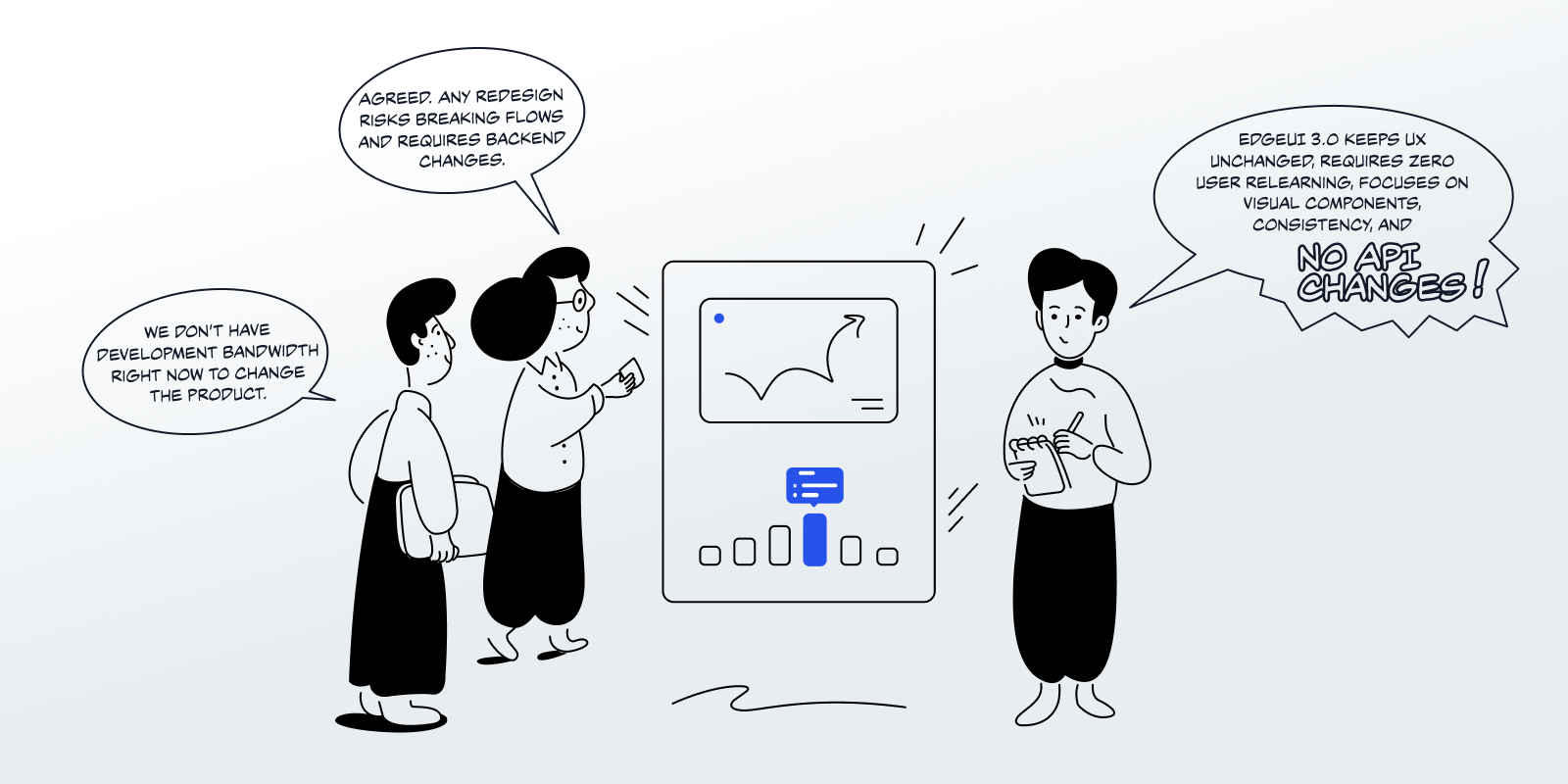
Refusing New Debt, Designing For Adoption
I rejected accumulating debt from rapid iterations. I set a constraint: preserve core UX, minimise backend changes, and remove the need for user relearning. The first goal wasn’t reinvention, it was an adoptable, scalable system the team could trust on day one.
Collaboration, Consistency, Velocity, And Future Readiness
Bridge design–dev with precise specs; cover frequently used components; enforce coherent visual language; modernize UI; and prepare for tokens/variables. EdgeUI 3.0 aimed for fast onboarding, fewer regressions, and a resilient foundation that scales to new features, clients, and white‑label demands.
Principles, Patterns, Accessibility, And Practical Trade‑offs
Across 4+ months, I studied typography scales, semantic colour systems, spacing grids, motion, and accessibility (WCAG). Each component had its own research loop—mapping states, edge cases, and interaction nuances—so guidance reflects InvestEdge’s real‑world usage, not generic best practices.
Learning From Leaders, Right‑Sizing For Reality
I analysed Untitled UI, Material, Ant Design, Shopify Polaris, Shipfaster UI, and Square UI. I extracted durable patterns, tokens, responsive grids, state models, and doc structure, then tailored decisions to InvestEdge’s domain complexity, enterprise needs, and delivery constraints.


Designing Around True Frequency And Risk
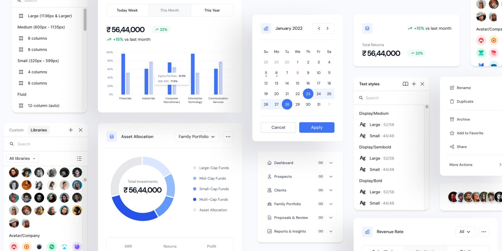
I audited screens to pinpoint key components, tables, filters, alerts, and focused the system on high-use, high-impact elements that drive daily workflows.
Analysed production screens to identify the most frequently used components and critical user interactions.
Mapped domain-specific elements like portfolio tables, filters, and alerts for InvestEdge workflows.
Prioritised high-impact components that support daily advisor tasks and client presentations.
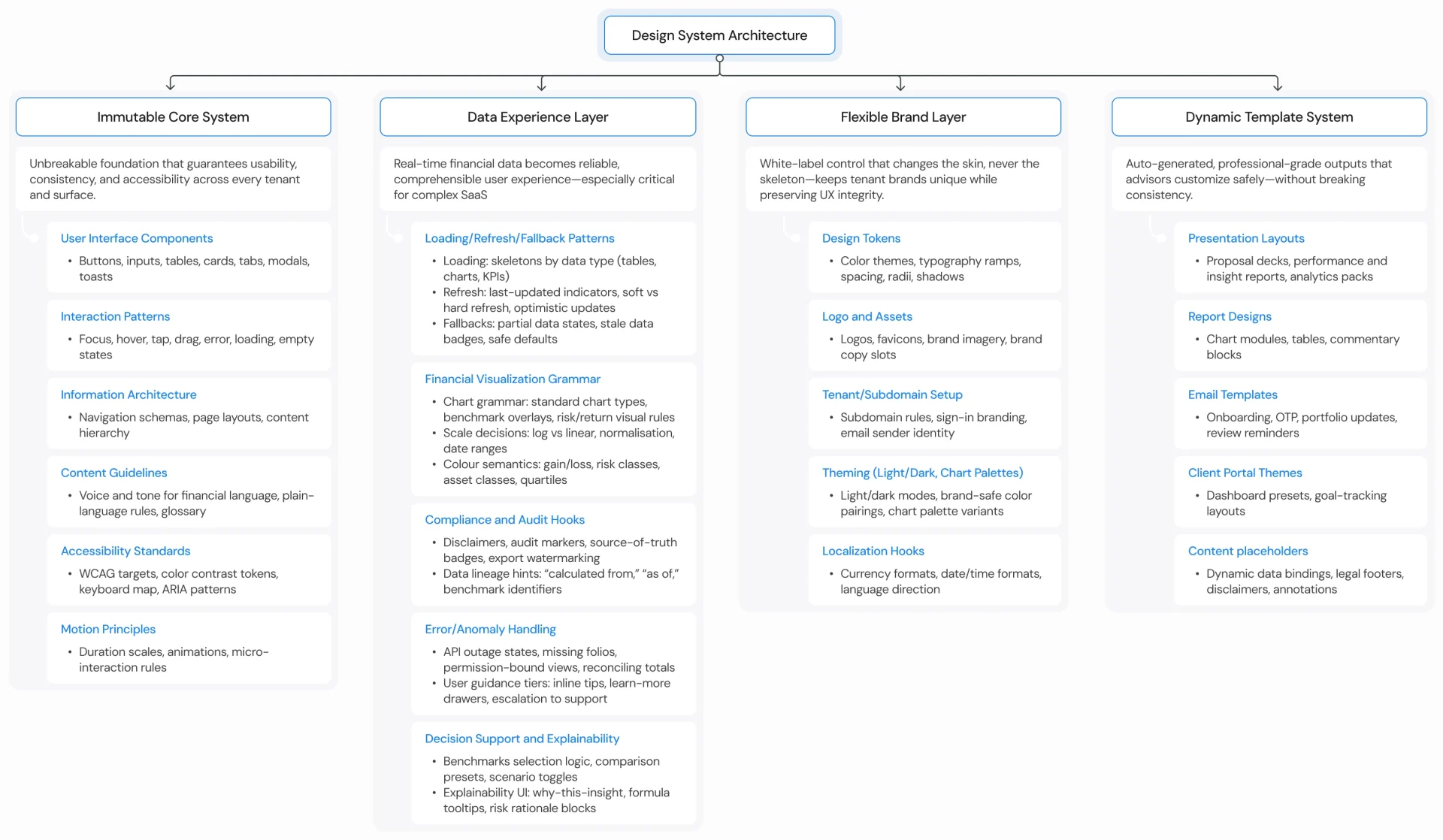
From Core To White‑Label. An Information Architecture
I defined four pillars: Core System (foundations), Product Theme (InvestEdge defaults), Enterprise Custom Theme (client‑specific skins), and White‑Labeling (brand swaps). I then planned a UI revamp, reorganized hierarchy, and sequenced effort toward areas with highest user impact and engineering leverage.
Preserve UX, Limit Backend Changes, Zero Relearning
I set non‑negotiables: 0–10% backend API change tolerance, no user relearning, and minimal disruption to live workflows. The system modernises visuals, clarifies patterns, and tightens semantics—without forcing costly refactors or risking advisor productivity during high‑stakes client engagements.
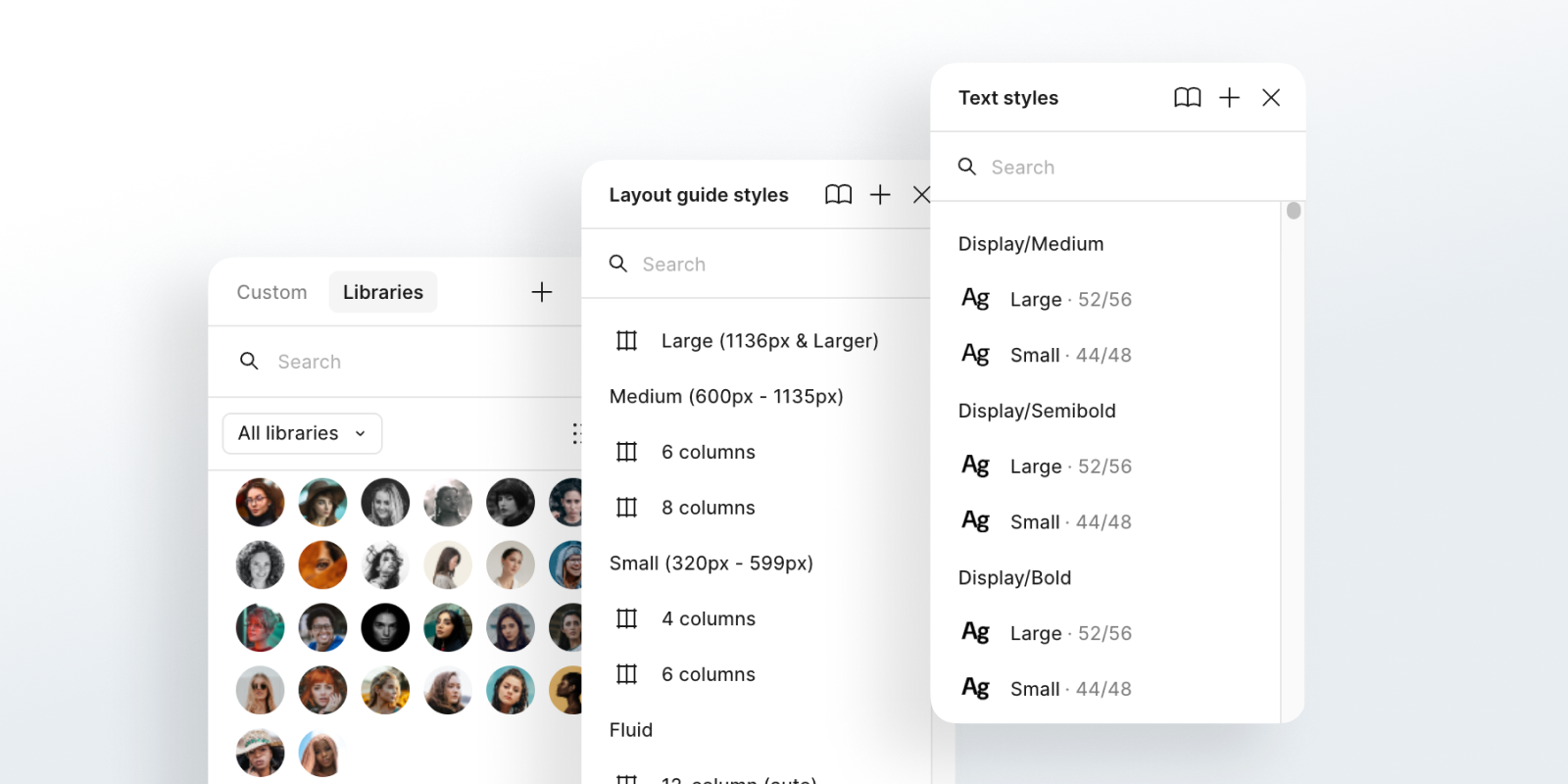
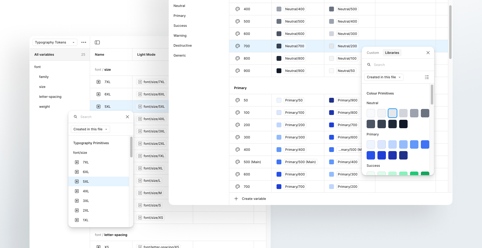
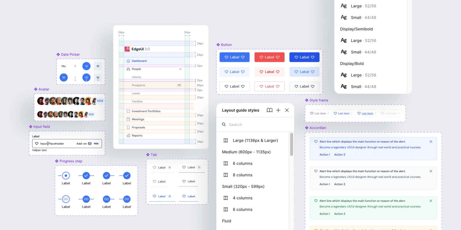
Components, Style Guide, Content Guide, And Docs
Deliverables include a 120+ component library; semantic typography, colour, spacing, and grid foundations; a content guide for clarity and tone; and a living documentation hub with do’s/don’ts and onboarding. Design variables and tokens are planned to accelerate future theming and customisation.
I prioritised buttons, inputs, selects, segmented controls, tabs, tables (sortable/paginated), chips/badges, alerts/toasts, modals/drawers, steppers, empty states, and form validation patterns. Each ships with states, accessibility notes, and examples.
Foundations, Components, Content, Docs, And Variables
Foundations: colours, typography, icons, illustrations, grids/layout. Components: buttons, inputs, alerts, badges, tables, and more. Content: principles, definitions, use cases, limitations. Documentation: best practices, do’s/don’ts, editorial and implementation guides. Variables/tokens: planned for multi‑brand agility.
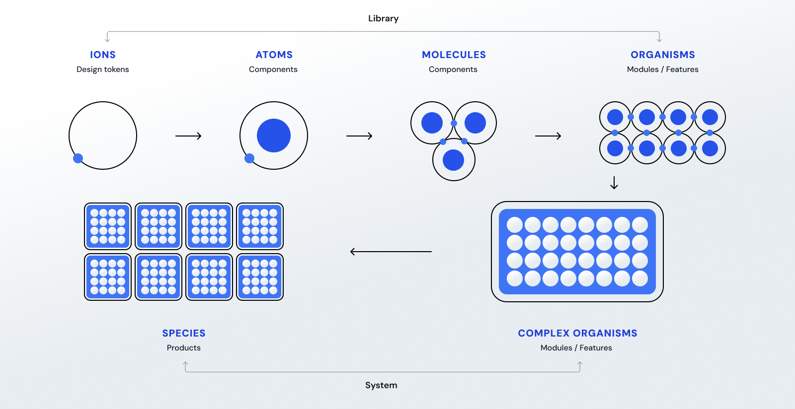
Atomic Design For Scalable, Testable Composition
I applied atomic design to structure foundations, patterns, and templates. This enforces consistency, clarifies ownership, and simplifies change management. Small, composable parts become reliable building blocks for complex flows, reducing duplication and enabling predictable, testable evolution.
From Drifting Patterns To Deliberate Consistency
Previously, spacing, states, and typography drifted across features and modules. EdgeUI 3.0 standardises hierarchy, strengthens contrast, and clarifies interactions. The new system delivers a cohesive, modern UI that improves scanability, reduces cognitive load, and increases confidence in critical tasks.
Transformed a rigid, manual sidebar into a flexible, variant-driven component that adapts to any use case through simple property changes.
Transformed repetitive manual UI tweaks into fast, reliable design by leveraging a comprehensive library of prebuilt, customisable components.
Established consistent colour, typography, and layout rules to eliminate guesswork and ensure design harmony across the platform.

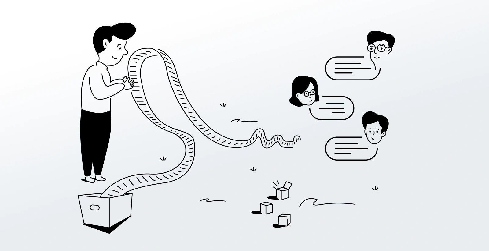
Continuous Refinement Through Cross‑Functional Review
I shipped in slices, gathered feedback from PM and engineering, and revised aggressively. Patterns evolved through usage, not theory. The iterative cadence built trust, increased adoption, and ensured EdgeUI 3.0 remained aligned to product reality and delivery timelines.
Make It Obvious, Even For First‑Time Users
EdgeUI 3.0 offers semantic type/colour scales, responsive grids, defined interaction states, form patterns, data‑display modules, and content principles. It’s designed for quick pickup, consistent handoffs, and reliable development—reducing ambiguity while enabling theming and controlled customisation.
Practical Features That Teams Actually Use
Every component includes anatomy, allowed variants, accessibility rules, and usage examples. For instance: button hierarchy and loading rules; data‑table density, sorting and pagination; alert severity mapping and recovery guidance. The docs turn decisions into teachable, repeatable practices.
Friction Down, Consistency Up, Confidence Restored
EdgeUI 3.0 transformed collaboration and reduced rework. The platform now presents unified visuals and predictable behaviours across modules and clients. Handoffs are faster, adoption is high, and 85% of initial goals were achieved—establishing a resilient baseline for ongoing growth.
Handoff Friction Reduced by
0%Component Reusability Across Products
0%Design Debt Cut by
0%Documentation Coverage at
Team Adoption Rate
Yes. The architecture anticipates tokens/variables, theme layers, and white‑labeling. Components are modular and versionable, enabling safe evolution. The system accommodates new features, client needs, and regulatory shifts without wholesale rewrites, protecting speed and quality as InvestEdge scales.
Conclusion, Learnings, and What Could Have Been Better.
Final reflections on delivery, key insights, and areas for continued improvement.
Pitching, Building, And Shipping Under Real Constraints
Balancing two major products, I pitched the revamp, owned delivery, and iterated via A/B testing and cross‑functional feedback. The result meets WCAG guidelines, improves responsiveness across devices, and strengthens developer alignment—without disrupting users or demanding backend overhauls.
Iteration, Communication, And Pragmatic Standards Win
Relentless iteration and fast feedback loops drive alignment. Precise, accessible documentation is a multiplier. Early, frequent conversations with engineering prevent drift. The wrap‑up: design systems succeed when they are adoptable, teachable, and measured by how well they help teams ship.
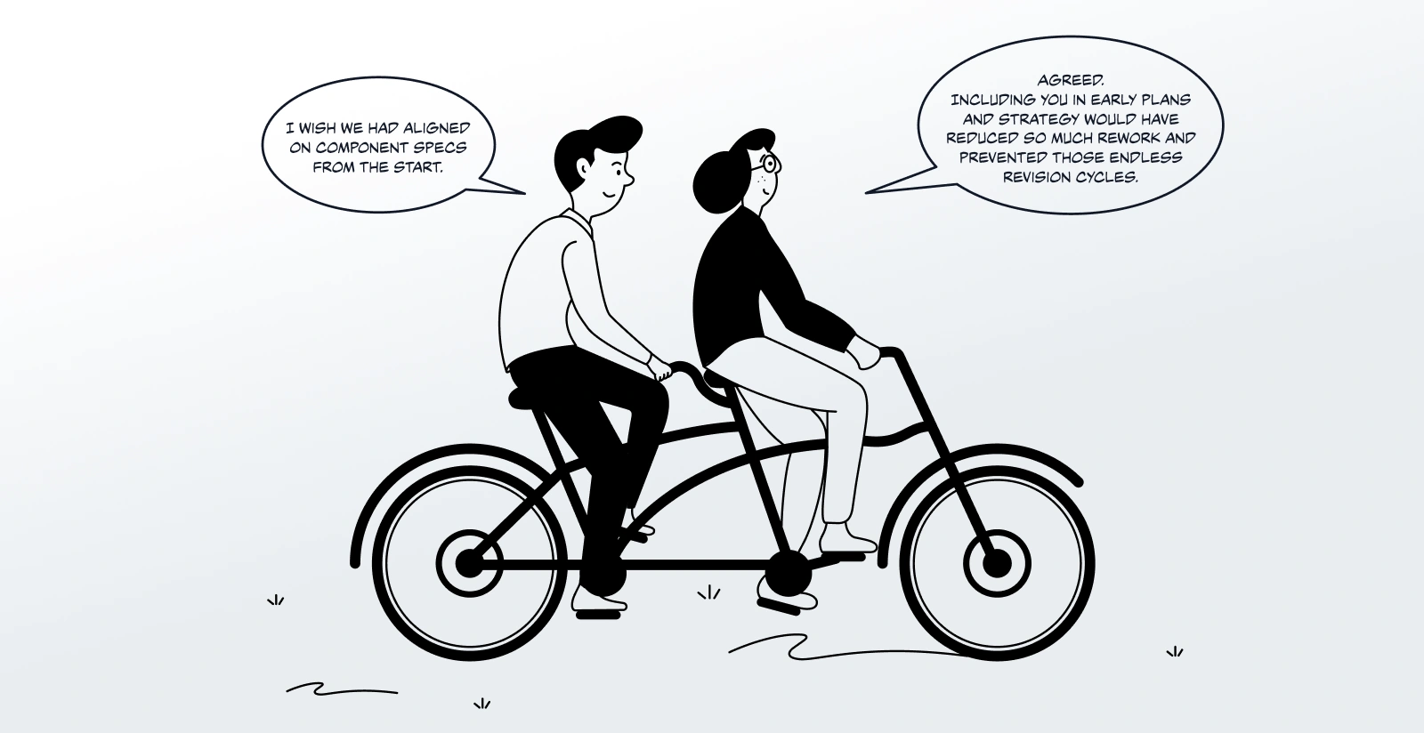
Earlier Systemization And Deeper Early Integrations
I would socialise the system earlier, involve developers from day zero, and push even tighter documentation coverage. Starting systemisation before rapid iteration spikes could have prevented debt. There’s always room to refine—and EdgeUI 3.0 is designed to keep improving.